The latest and greatest (2013)
In 2012 it was decided that Fleur-de-coin.com will move from classic ASP to ASP.NET (C#). Work started in January 2012,
but it was not until 16 February 2013 that the new site rolled-out. The design of the site is almost identical, but the
Coin Shop was completely rewritten offering the best online services worldwide. A wish-list, a
price history for all items, the ability to save your searches in RSS, the improved image
galleries and many other features are now available and will make life easier for our customers, but also for regular users.
Using Responsive Web Design principles, we were able to create a layout that works great in a multitude of browsers,
from Internet Explorer 6, to the latest versions of Chrome and handheld devices. We have checked the entire site in the following
browsers and found that it works great!
Mozilla Firefox
This browser is our preferred developing platform, largely due to the Firebug add-on. We checked
the entire site on version 18.0.2 and found that all design elements, plus functionality, are 100% supported.
Google Chrome
The second browser of choice has also been tested extensively. Chrome supports the latest web standards and
supports 100% of Fleur-de-coin.com's design and features. We used the developer's version 26..0.1403.0 dev-m to
check the site.
Internet Explorer 8 & 9
Internet Explorer in all versions and all incarnations is unfortunately the worst browser available. However,
the latest version is pretty standards compatible and gave us no significant problems, supporting the new design 100%.
Mobile browsers
Amazingly enough, 14.42% of our users use their mobile devices to surf the site. Although the site was already mobile
friendly, moving to a new programming platform triggered a major redesign of the mobile version too.
It is now easier and faster to browse the site with your mobile phone or other handheld devices, as we went to
great lengths in order to reduce the size of the webpages and images displayed, but also modify the layout in order to
visually help mobile users search for the content they are interested in. We checked the new layout on Mobile Firefox,
Mobile Opera, Android Browser (ICS) and Mobile Chrome.
We also used a Blackberry device to check the site and LG GT505 to make sure it displays correctly across propriatery
platforms too. Although we did not test Fleur-de-coin.com on iPhone, it should display correctly since it is 100%
supported by iPad.
Design circa 2010
Since 2003, numerous smaller and bigger improvements
were incorporated in the design. The content got better and new services were introduces, such as the
Coin Vault. Although the layout was still Ok, especially compared to other sites
about coin collecting, it was again time for a complete overhaul. It all started when we decided to rewrite the
Coin Vault and build the Swap Area. When development was
finished working, I realized that these web applications were too modern for the current layout and after a few
days (only) I rolled out the new design. My main focus was the correct use of whitespace, because the site felt
too cramped.
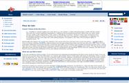
| 3-columns layout |
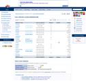
Collectors database |
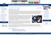
Old menu |
Shop layout |
 |
 |
 |
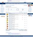 |
The old site felt like it didn't have enough space; the page elements starved for more space and my webpages
had too many icons which were confusing my visitors. The focus of the new design is whitespace. I wanted to make
things more relaxed and completely abandoned the left column, moving the menu of the site at the bottom of the
page. Thus, the 3-column layout was abandoned in favor of a better looking 2-column layout.
Redesigning Fleur-de-coin.com
As time passed and traffic soared, I started receiving request to sell coins. I never had the intention of
selling coins online (or offline for that matter), so I turned down all my potential 'customers'. However the
requests kept coming and I decided to give it a try. I built a basic online Coin Shop
and decided to purchase a domain to make things more official. I also decided to redesigning the site from
scratch, a tedious and time consuming task which lasted several weeks. My first and formost concern, was to present
a very different layout which wouldn't be based so much on javascript. As a matter of fact, eliminating javascript
completely was high on my priority list, which unfortunately I was not able to accomplish entirely.
| Previous Design |
"New" Design |
 |
 |
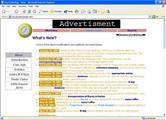
| Although I did like the old design, I wanted to get rid of the dynamic javascript
menus. This was probably the most important reason behind the redesign |
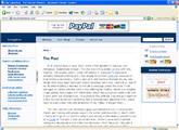
The new design is based heavily on Cascading Style Sheets and Active Server Pages,
but includes much less javascript which does not intefer with its functionality even if it is turned of
|
Designing Fleur-de-coin.com
The first version of the site was spawned from my very first homepage, created in 1997. Since collecting coins was -
and still is- one of my favourite hobbies, I decided to include a page about the
coins in my collection and the coins I was offering for exchange. Slowly but steadily, I kept adding more
pages with information about the currencies circulating world-wide and it soon grew out of proportion. It was
time to start organizing things and I quickly put together a new section about coin collecting. Soon, it became
apparent that I would have to build a new web-site dedicated to my hobby and I did just that...
The new website was absolutely great and helped me a lot in making new friends and exchanging coins with people
around the world. Unfortunately, in March 1999 I had to let it go for 23 months while I was serving in the Hellenic
Armed Forces as a Cadet at first and a 2nd Lieutenant later. When I came back I started programming again and
developed the World Collectors Database, where people could add, edit and
remove their names without emailing me (as it was the usual solution at that time internet-wide). The database
was a relative success, so I started adding new features.
| Old Design |
"New" Design |
 |
 |
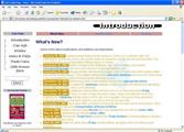
| The old design looked nice (at the time), so the colors and overall visual impression
remained unchanged. I only needed to find some room for banners and more complicated menus |
The "new" design was based on Javascript and Active Server Pages, providing better
management, improved functionality and more possibilities for future updates |
When I first started redesigning the site, I tried hard to come up with a relatively classic layout, as I knew
I wouldn't be able to update it very often. I believe the final result was absolutely great, and it looked quite
modern and fresh even after 3 years. The name I had chosen was -the rather generic- "Coin Site", but when I found
out that it already taken I switched to "Coin Fever", which included the following sections:
- Personal Information: Included some information I was willing to share on-line.
- Readers Unite: I always believed in users' participation and the site
desperately called for the help of its visitors. Unfortunately, few people ever responded...
- Coin Information: A few words about the coinage, mints and
currencies of several countries, plus related terminology. Moreover, a coin gallery with a variety
of coin pictures coupled with a brief description.
- Coin Articles: Some general articles about coins and coin collecting
- Trade Coins: The most important section of the site, as it generated most
of the traffic. The title is pretty self-explanatory, and the
World Collectors Database can be found in the new site too
- Links & FAQs: Some links to other sites with valuable content
- Little-known Facts: Useless, funny, strange, call them what you will
It all started back in June 1997, when I first decided to build my own homepage. Surprisingly
enough, the original site was still around for years after I abandoned it and you can still visit it on
Web archive.
Take a look at it and see how dramatically my web design skills have improved!
Logo and motto
Finding a name for my site was harder than most people would assume. At first I tried a
rather generic title, such as "Coin Site", but pretty soon I wanted to change it and for a while I used
"Coin World" instead. Unfortunately, I soon found out the name was
already taken by a rather famous publication so I had no
other option than to let it go. While I was searching for a better title, I decided to go for something original
that -at the same time- would represent the excitement coin collectors feel when dealing with their collections.
I came up with "Coin Fever", coupled with the motto "Discover your coins" which I still use today. I soon got
tired of this name too however, so I switched to "Coin Collecting". Not very original, but it improved my page
ranking in Google so I kept it for quite some time.
| Coin World |
Coin Collecting |
Fleur-de-coin |
 |
 |
 |
After a while, I decided to register a domain and soon realized I would have to find yet
another title for my site. Every single cobination of the words "coin", "collect", "site" etc were already
taken, apart from "Coins4you" which was suggested by my girfriend and was my second best choice. After a couple
of days, it hit me ... "Fleur de coin". It is a coin term with a poetic touch into it and since it denotes to
a flawless coin it was an obvious choice for my flawless website(!!). Unfortunately it was taken too, but
"Fleur-de-coin" was not and I quickly registered it for 3 years on August 22, 2003. I also kept the motto
"Discover your coins..." and started searching for a new logo.